Weekly Open (Current Week Only)📘 Indicator Name: Weekly Open (Current Week Only)
📝 Description:
This indicator plots a horizontal line representing the weekly open price, visible only during the current trading week. At the beginning of each new week (based on TradingView’s weekly time segmentation), the indicator captures the open price of the first candle and draws a constant line across the chart until the week ends. Once the new week begins, the line resets and updates with the new weekly open.
🎯 How to Use – ICT Concepts Integration (Weekly Profile):
This tool is designed to complement ICT (Inner Circle Trader) trading strategies, particularly within the weekly profile framework, by offering a clear and persistent visual of the weekly open, which is a critical reference point in ICT’s market structure theory.
✅ Use Cases:
Directional Bias:
According to ICT concepts, price trading above the weekly open suggests a bullish bias for the week, while trading below it implies bearish conditions.
Traders can use the weekly open line to align their intraweek trades with higher timeframe directional bias.
Dealing Ranges:
Weekly open helps frame the weekly dealing range, especially when combined with other levels like weekly high/low or previous week’s range.
It allows traders to identify potential liquidity pools or areas where price may seek to rebalance.
Mean Reversion Entries:
Price often reverts to or reacts from the weekly open. Traders may use this as a target or entry level, particularly during Monday/Tuesday setups.
Works well in conjunction with concepts like OTE (Optimal Trade Entry) and Judas Swings.
Risk Management:
Acts as a clean and visual anchor to structure stop losses or take-profits based on weekly bias shifts.
Cerca negli script per "Inner circle trader "
ICT MACRO MAX RETRI ( ALERT )🖤 ICT Reversal Detector – Minimalist Edition
This indicator is designed for traders who follow Inner Circle Trader (ICT) concepts, particularly focused on liquidity sweeps and displacement reversals.
It detects:
• Swing Highs & Lows that occur during the most reactive windows of each hour
→ Specifically the last 20 minutes and first 15 minutes
(ICT teaches these moments often reveal macro-level reversals. I’ve expanded the window slightly to give the indicator more room to catch valid setups.)
• Liquidity Sweeps of previous highs/lows
• Displacement (State Change): defined as a manipulation wick followed by 1–3 strong candles closing in the opposite direction
Visually:
• Clean black lines pointing right from the liquidity sweep wick
• White triangle markers inside black label boxes only when valid displacement occurs
• No clutter, no unnecessary shapes — just focused signal
Built for:
• 5-minute charts, especially NASDAQ (NAS100) and S&P 500 (SPX500)
• Confirm setups manually on the 15-minute chart for extra precision
This is a partial automation tool for ICT-style reversal traders who prefer clarity, minimalism, and sharp intuition over noise.
Let it alert you to setups — then decide like a sniper.

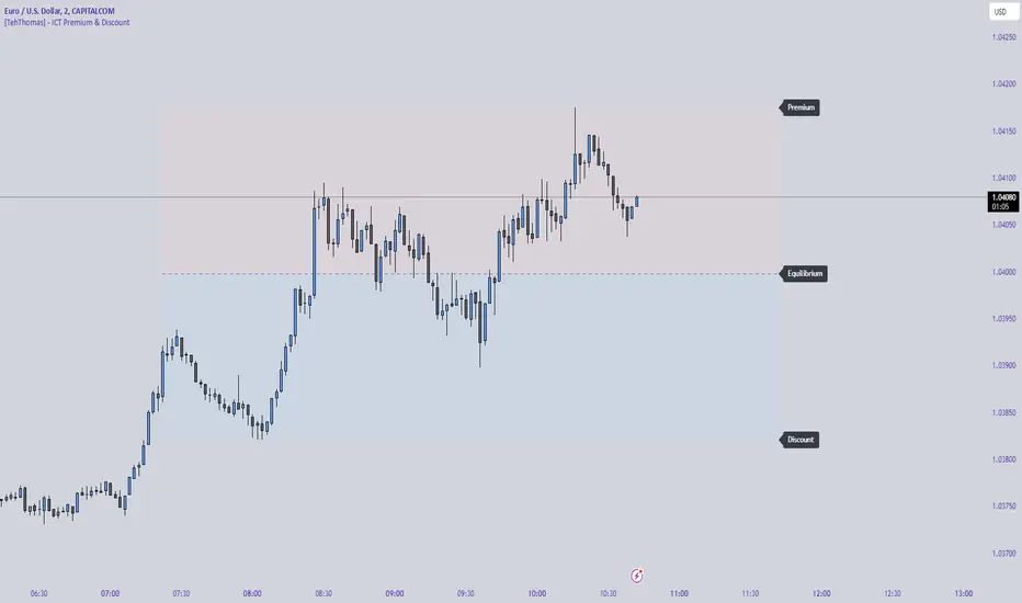
CandelaCharts - Premium & Discount 📝 Overview
Premium and Discount are key concepts in ICT (Inner Circle Trader) trading strategies, used to pinpoint ideal entry and exit points in the market. These concepts are based on an understanding of market structure and the behavior of institutional traders, commonly referred to as Smart Money.
To understand the Premium and Discount zones, it's crucial to first grasp the concept of the equilibrium level, also known as the basic or fair value. The equilibrium represents the midpoint of a given price range and acts as a reference point, dividing the range into Premium and Discount zones.
The equilibrium reflects the "fair value" of the price within the considered range. Traders use this as a benchmark to assess whether the current price is in the Premium or Discount zone.
The Premium zone lies above the equilibrium level, while the Discount zone is located below it within the price range.
📦 Features
Swing-based detection
Custom detection
Modes
Styling
⚙️ Settings
Range: Determines how you will identify Premium and Discount, either by swing points or by custom date.
Mode: Controls what UI will be displayed
Premium: Sets the Premium color
Discount: Sets the Discount color
Equilibrium: Sets the Equilibrium color
Labels: Controls the labels visibility
⚡️ Showcase
Pro Mode
Solid Mode
Outlined Mode
Flat Mode
The Indicator can be effortlessly applied in replay mode to highlight premium and discount zones based on the most prominent market swings.
🚨 Alerts
The indicator does not provide any alerts!
⚠️ Disclaimer
Trading involves significant risk, and many participants may incur losses. The content on this site is not intended as financial advice and should not be interpreted as such. Decisions to buy, sell, hold, or trade securities, commodities, or other financial instruments carry inherent risks and are best made with guidance from qualified financial professionals. Past performance is not indicative of future results.

SMT Divergence ICT 02 [TradingFinder] Smart Money Technique SMC🔵 Introduction
SMT Divergence (Smart Money Technique Divergence) is a price action-based trading concept that detects discrepancies in market behavior between two assets that are generally expected to move in the same direction. Rooted in ICT (Inner Circle Trader) methodology, this approach helps traders recognize subtle signs of market manipulation or imbalance, often ahead of traditional indicators.
The core idea behind SMT divergence is simple: when two correlated instruments—such as currency pairs, indices, or assets from the same sector—start forming different swing points (highs or lows), this can reveal a lack of confirmation in the trend. Such divergence is often a precursor to a price reversal or pause in momentum.
This technique works effectively across various markets including Forex, stocks, and cryptocurrencies. It’s particularly valuable when used alongside concepts like liquidity sweeps, market structure breaks (MSBs), or order block identification.
In advanced use cases, Sequential SMT helps uncover patterns of alternating divergences across sessions, often signaling engineered liquidity traps before price reacts.
When combined with the Quarterly Theory—which segments market behavior into Accumulation, Manipulation, Distribution, and Continuation/Reversal phases—traders gain insight not only into where divergence happens, but when it's most likely to be significant within the market cycle.
Bullish SMT :
Bullish SMT Divergence occurs when one asset prints a higher low while the correlated asset forms a lower low. This asymmetry often suggests that the downside move is losing strength, hinting at a potential bullish shift.
Bearish SMT :
Bearish SMT Divergence is formed when one asset creates a higher high, while the second asset fails to confirm by printing a lower high. This typically signals weakening bullish pressure and the possibility of a reversal to the downside.
🔵 How to Use
The SMT Divergence indicator is designed to detect imbalances between two positively correlated assets—such as major currency pairs, indices, or commodities. These divergences often indicate early signs of market inefficiency or smart money manipulation and can help traders anticipate trend shifts with higher precision.
Unlike traditional divergence indicators or earlier versions of this script, this upgraded version does not rely solely on consecutive pivot comparisons. Instead, it dynamically scans all available pivots within the chart to identify divergences at any structural level—major or minor—across the price action. This broader detection method increases the reliability and frequency of meaningful SMT signals.
Moreover, when integrated with Sequential SMT logic, the indicator is capable of identifying multiple divergence sequences across sessions. These sequences often signal engineered liquidity traps and can be mapped within the Quarterly Theory framework, allowing traders to pinpoint not just the presence of divergence but also the phase of the market cycle it appears in (Accumulation, Manipulation, Distribution, or Continuation).
🟣 Bullish SMT Divergence
This signal occurs when the primary asset forms a higher low, while the correlated asset forms a lower low. This pattern implies weakening bearish momentum and a potential shift to the upside.
If the correlated asset breaks its previous low but the primary asset does not, this divergence suggests absorption of selling pressure and possible accumulation by smart money—making it a strong bullish signal, especially when aligned with a favorable market phase (e.g., the end of a manipulation phase in Q2).
🟣 Bearish SMT Divergence
This signal occurs when the primary asset creates a higher high, while the correlated asset forms a lower high. This mismatch indicates fading bullish momentum and a potential reversal to the downside.
If the correlated asset fails to confirm a breakout made by the main asset, the divergence may point to distribution or exhaustion. When seen within Q3 or Q4 phases of the Quarterly Theory, this pattern often precedes sharp declines or fake-outs engineered by smart money
🔵 Settings
⚙️ Logical Settings
Symbol : Choose the secondary asset to compare with the main chart asset (e.g., XAUUSD, US100, GBPUSD).
Pivot Period : Sets the sensitivity of the pivot detection algorithm. A smaller value increases responsiveness to price swings.
Activate Max Pivot Back : When enabled, limits the maximum number of past pivots to be considered for divergence detection.
Max Pivot Back Length : Defines how many past pivots can be used (if the above toggle is active).
Pivot Sync Threshold : The maximum allowed difference (in bars) between pivots of the two assets for them to be compared.
Validity Pivot Length : Defines the time window (in bars) during which a divergence remains valid before it's considered outdated.
🎨 Display Settings
Show Bullish SMT Line : Draws a line connecting the bullish divergence points.
Show Bullish SMT Label : Displays a label on the chart when a bullish divergence is detected.
Bullish Color : Sets the color for bullish SMT markers (label, shape, and line).
Show Bearish SMT Line : Draws a line for bearish divergence.
Show Bearish SMT Label : Displays a label when a bearish SMT divergence is found.
Bearish Color : Sets the color for bearish SMT visual elements.
🔔 Alert Settings
Alert Name : Custom name for the alert messages (used in TradingView’s alert system).
Message Frequency :
All : Every signal triggers an alert.
Once Per Bar : Alerts once per bar regardless of how many signals occur.
Per Bar Close : Only triggers when the bar closes and the signal still exists.
Time Zone Display : Choose the time zone in which alert timestamps are displayed (e.g., UTC).
Bullish SMT Divergence Alert : Enable/disable alerts specifically for bullish signals.
Bearish SMT Divergence Alert : Enable/disable alerts specifically for bearish signals
🔵Conclusion
The SMT Plus indicator offers a refined and powerful approach to detecting smart money behavior through divergence analysis between correlated assets. By removing the limitations of consecutive pivot comparisons and allowing for broader structural detection, it captures more accurate and timely signals that often precede major market moves.
When paired with frameworks like Sequential SMT and the Quarterly Theory, the indicator not only highlights where divergence occurs, but also when in the market cycle it's most likely to matter. Its flexible settings, customizable visuals, and integrated alert system make it suitable for intraday scalpers, swing traders, and even long-term macro analysts.
Whether you're using it as a standalone decision-making tool or combining it with other ICT concepts, SMT Plus gives you an edge in recognizing manipulation, timing reversals, and staying in sync with the real market narrative—not just the chart.

ICT & SMC Multi-Timeframe by [KhedrFX]Transform your trading experience with the ICT & SMC Multi-Timeframe by indicator. This innovative tool is designed for traders who want to harness the power of multi-timeframe analysis, enabling them to make informed trading decisions based on key market insights. By integrating concepts from the Inner Circle Trader (ICT) and Smart Money Concepts (SMC), this indicator provides a comprehensive view of market dynamics, helping you identify potential trading opportunities with precision.
Key Features
- Multi-Timeframe Analysis: Effortlessly switch between various timeframes (5 minutes, 15 minutes, 30 minutes, 1 hour, 4 hours, daily, and weekly) to capture the full spectrum of market movements.
- High and Low Levels: Automatically calculates and displays the highest and lowest price levels over the last 20 bars, highlighting critical support and resistance zones.
- Market Structure Visualization: Identifies the last swing high and swing low, allowing you to recognize current market trends and potential reversal points.
- Order Block Detection: Detects significant order blocks, pinpointing areas of strong buying or selling pressure that can indicate potential market reversals.
- Custom Alerts: Set alerts for when the price crosses above or below identified order block levels, enabling you to act swiftly on trading opportunities.
How to Use the Indicator
1. Add the Indicator to Your Chart
- Open TradingView.
- Click on the "Indicators" button at the top of the screen.
- Search for "ICT & SMC Multi-Timeframe by " in the search bar.
- Click on the indicator to add it to your chart.
2. Select Your Timeframe
- Use the dropdown menu to choose your preferred timeframe (5, 15, 30, 60, 240, D, W) for analysis.
3. Interpret the Signals
- High Level (Green Line): Represents the highest price level over the last 20 bars, acting as a potential resistance level.
- Low Level (Red Line): Represents the lowest price level over the last 20 bars, acting as a potential support level.
- Last Swing High (Blue Cross): Indicates the most recent significant high, useful for identifying potential reversal points.
- Last Swing Low (Orange Cross): Indicates the most recent significant low, providing insight into market structure.
- Order Block High (Purple Line): Marks the upper boundary of a detected order block, suggesting potential selling pressure.
- Order Block Low (Yellow Line): Marks the lower boundary of a detected order block, indicating potential buying pressure.
4. Set Alerts
- Utilize the alert conditions to receive notifications when the price crosses above or below the order block levels, allowing you to stay informed about potential trading opportunities.
5. Implement Risk Management
- Always use proper risk management techniques. Consider setting stop-loss orders based on the identified swing highs and lows or the order block levels to protect your capital.
Conclusion
The ICT & SMC Multi-Timeframe by indicator is an essential tool for traders looking to enhance their market analysis and decision-making process. By leveraging multi-timeframe insights, market structure visualization, and order block detection, you can navigate the complexities of the market with confidence. Start using this powerful indicator today and take your trading to the next level.
⚠️ Trade Responsibly
This tool helps you analyze the market, but it’s not a guarantee of profits. Always do your own research, manage risk, and trade with caution.
ICT IPDA Lookback / Cast-forwardThis script automatically displays 20/40/60 daily range highs and lows.
Known as IPDA ranges, a term popularised by Inner Circle Trader (ICT). IPDA = Interbank Price Delivery Algorithm.
You can also add 80 day lines (my own addition) . IPDA labels are shown for Daily highs, and an equivalent line is drawn at IPDA Daily lows - but without the label to keep your chart as clean as possible. You can use this on hourly timeframes as well.
ICT is "flexible" on IPDA data ranges in his mentorship regarding whether you should use the first day of each month, or go recalculate day by day, and that's why this script lets you do both + also has an option to set a hard specified date - useful for more advanced purposes.
You can also Cast-forward the displayed 20/40/60 (+80) IPDA ranges with this tool.
You can use IPDA ranges to forecast Highs and Lows that price will be attracted to on a Daily timeframe and where price is in its P/D range, being in a discount or premium. You can also use this knowledge to help guide lower timeframe scalps.
Longer term traders can reference the 40 and 60 Day Look Back lines for an indication of current market conditions.

ICT & RTM Price Action IndicatorICT & RTM Price Action Indicator
Unlock the power of precision trading with this cutting-edge indicator blending ICT (Inner Circle Trader) concepts and RTM (Reversal Trend Momentum) strategies. Designed for traders who demand clarity in chaotic markets, this tool pinpoints high-probability buy and sell signals with surgical accuracy.
What It Offers:
Smart Supply & Demand Zones: Instantly spot key levels where the market is likely to reverse or consolidate, derived from a 50-period high/low analysis.
Filtered Reversal Signals: Say goodbye to fakeouts! Signals are confirmed with volume spikes (1.5x average) and a follow-through candle, ensuring you trade only the strongest moves.
Trend-Aware Logic: Built on a customizable SMA (default 14), it aligns reversals with momentum for trades that stick.
One-Signal Discipline: No clutter—only the first valid signal appears until an opposing setup triggers, keeping your chart clean and your focus sharp.
Combined Power: A unique "TRADE" signal merges ICT zones with RTM reversals for setups with double the conviction.
Why You’ll Love It:
Whether you’re scalping intraday or hunting swing trades, this indicator adapts to your style. It’s not just another tool—it’s your edge in decoding price action like a pro. Test it, tweak it, and watch your trading transform.

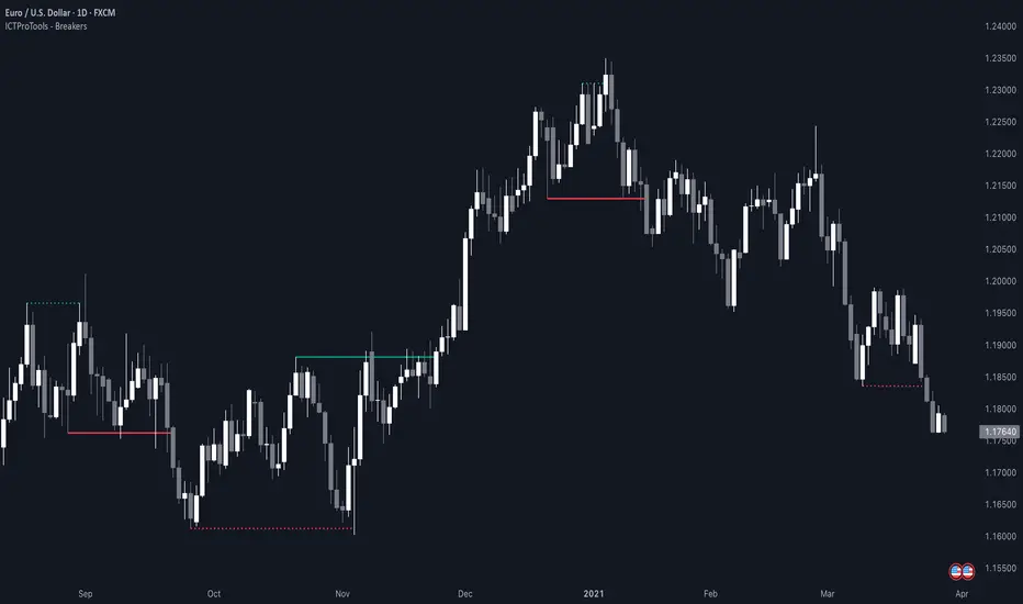
ICT Breakers (BOS / MSS - Market Structure) [ICTProTools]The Breakers (Market Structure) indicator is designed to help traders identify true breaker structures , a key concept in Inner Circle Trader (ICT) methodology. In market structure, Breakers represent powerful shifts where a key high or low is broken, leading to a reversal in market direction. Most tools misinterpret structure shifts, using internal structure , leading to fake breakouts. This tool solves that problem by filtering out false signals , providing clear & structured insights , all with multi-timeframe compatibility.
💎 Key Features
⚡️ Breakers in action
The indicator shows the structure following ICT instructions. A breaker is defined by two lines:
The first line confirms the previous trend (it could be interpreted as a BOS).
The second line highlights the moment price breaks structure (with candle body or wick based on your chosen settings), signaling a shift in trend direction (like an MSS).
Furthermore, it’s important to note that a breaker not only shows the structure, but also defines a potential Point of Interest (POI), an area where price may retrace before continuing its trend.
Here, we can observe two clear structure shifts.
On the far left, the market was in a bearish trend, illustrated by the first visible (dotted and red) line. Shortly after, the second (solid and green) line appears, showing a break that initiates a new bullish trend.
This upward movement continues, with the last confirmation marked by a top structure line. And finally, the structure is broken once again indicating a transition back into a bearish trend.
💪 Real Structure with True Highs / Lows
Unlike many indicators that detect internal breakouts , this tool follows ICT’s true market structure rules .
In a bearish trend , a bullish breaker is only confirmed when the high that created the low is broken , and conversely for a bullish scenario.
Fake breakouts are ignored, preventing misleading signals.
In the image above, the white breakout is correctly ignored by the indicator, as it doesn't align with ICT’s structural rules. That white high is simply part of the internal structure, not the true swing point. Instead, the green line highlights the key level that truly matters, the one whose rupture would have confirmed a real change in market structure.
🔔 Smart Alerts for Structure Updates
Stay one step ahead with customizable alerts designed to notify you instantly when market structure changes occur.
Get notified for BOS (Continuation) and / or MSS (Breaker) events.
Set alerts for bullish , bearish , or both directions.
Choose between once or repeated alerts , based on your strategy.
This feature allows traders to remain focused and reactive , even when monitoring multiple markets.
In the alert settings, select which structure shifts you want to be notified of. Whether you're a scalper or a swing trader, the alerts keep you connected to key moments without needing to constantly monitor the chart.
⏳ Multi-Timeframe Structure
All features of the indicator are fully compatible with higher timeframes .
Get a broader view of market structure without switching timeframes.
Monitor higher timeframe structures and receive alerts, all without leaving your analysis chart .
In this example, the market structure of the 30m timeframe is displayed while on a 5m chart, providing a clearer perspective.
✨ Customization & User Control
Make it yours! The indicator allows full customization:
Swing bars (to confirm high / low)
Select your mode for Breakers (MSS) , using the candle body only or body / wick
Line style (type, width, color)
Choice of displayed timeframe
Activate any alert , with the frequency you want
🎯 Conclusion
✅ Avoid false signals by focusing on true ICT Breakers
✅ Smart alerts to never miss a structural shift
✅ Multi-timeframe support for enhanced analysis
✅ Clean & professional design for an optimal trading experience
ICT SMT (fadi)The ICT SMT (fadi) Indicator is a powerful indicator inspired by the Inner Circle Trader (ICT) methodology, designed to identify Smart Money Technique (SMT) divergences between correlated assets. This indicator helps traders spot potential reversal points or trend shifts by comparing price action of a user-defined symbol (e.g., “ES1!” for E-mini S&P 500 futures) against the current chart’s price structure. Ideal for forex, indices, futures, and crypto markets, it highlights discrepancies in correlated asset behavior to enhance trading decisions.
These discrepancies occur when one asset shows signs of strength—such as holding support or rallying—while the other weakens or drops, signaling potential manipulation or a shift in smart money activity. This is relevant because it reveals where institutional traders may be accumulating or distributing positions, giving insight into impending trend changes. This indicator offers higher accuracy and detects nearly every SMT present on the chart by calculating multiple possibilities.
Features
• Smart Algorithmic detection of high probability SMTs
• Detect SMT with two other symbols
• Detect 2-Candle SMT as an additional configurable option
• Confirmation and Invalidation levels
• Expand or narrow the detection range by changing the number of pivots to use
• Raise alerts when SMT has been detected
Usage
1. Apply the indicator to your chart.
2. In the settings, input a correlated symbol (e.g., “NQ1!” for Nasdaq futures if charting “ES1!”, or “EURUSD” if analyzing “GBPUSD”).
3. Monitor the plotted markers and labels:
• Green markers for bullish divergences.
• Red markers for bearish divergences.
4. Combine with other ICT concepts (e.g., order blocks, liquidity zones) for higher-probability setups.
Best Practices
• Pair with strongly correlated assets (e.g., ES vs. NQ, EURUSD vs. GBPUSD) for reliable signals.
• Backtest on your chosen market to confirm effectiveness.

ST -Dashboard Volume MTF , [Sese04]User Guide: ST - Dashboard Volume MTF
Introduction
This script displays a multi-timeframe (MTF) volume dashboard, tracking buy and sell volumes and the moving averages of volume. It is designed for traders using ICT (Inner Circle Trader) and SMC (Smart Money Concepts) to quickly visualize market dynamics across multiple timeframes.
Settings and Features
📌 User Inputs
Customizable settings allow traders to adjust the dashboard display and volume moving averages.
Volume Display per Timeframe
show_vol_1m: Show volume for 1-minute chart.
show_vol_5m: Show volume for 5-minute chart.
show_vol_15m: Show volume for 15-minute chart.
show_vol_1h: Show volume for 1-hour chart.
show_vol_4h: Show volume for 4-hour chart.
show_vol_1d: Show volume for 1-day chart.
Volume Moving Average Settings
ma_length_short: Length of the short-term moving average (default 5 periods).
ma_length_long: Length of the long-term moving average (default 14 periods).
Dashboard Customization
dashboard_position: Dashboard position (Bottom Right, Bottom Left, Top Right, Top Left).
text_color: Text color for the dashboard.
text_size: Text size (small, normal, large).
How the Script Works
🔹 1. Calculating Buy and Sell Volume
The calculate_buy_sell function separates buy and sell volume based on the candle's open and close price:
If the closing price is higher than the opening price → Buy volume 📈.
If the closing price is lower or equal to the opening price → Sell volume 📉.
🔹 2. Retrieving Volume Data Across Multiple Timeframes
The function get_volumes collects buy and sell volume data for different timeframes using request.security().
The available timeframes are: 1m, 5m, 15m, 1h, 4h, and 1d.
🔹 3. Calculating Volume Moving Averages
The script uses ta.sma() to compute moving averages for volume trends:
ma_vol_short: Short-term moving average (e.g., 5 periods).
ma_vol_long: Long-term moving average (e.g., 14 periods).
🔹 4. Creating and Displaying the Dashboard
A table (table.new()) is generated at the last bar (barstate.islast) to display the volume data:
A title “📊 Volume Dashboard (Buy vs Sell)” in purple.
Column headers:
TIMEFRAME (e.g., 1M, 5M, 15M, 1H, 4H, 1D).
BUY VOLUME (dark blue).
SELL VOLUME (dark red).
Buy and Sell Volume values are displayed in their respective cells for easy reading.
How to Use This Script on TradingView?
Adding the Script
Open TradingView.
Go to Pine Editor and paste the script.
Click "Add to Chart".
Configuring the Settings
Open the indicator settings.
Enable/disable the desired timeframes.
Adjust the moving average lengths if necessary.
Interpreting the Data
Increasing buy volume across timeframes may indicate bullish momentum.
Rising sell volume suggests a bearish reversal.
Crossovers of volume moving averages can help detect market shifts.
Conclusion
This script is a powerful tool for analyzing volume dynamics across multiple timeframes. It provides a quick overview of the balance between buyers and sellers, essential for ICT scalping and liquidity-based trading.
🚀 Pro Tip: Combine this dashboard with other SMC indicators (engulfing candles, pivot points) to refine your trading decisions.

Quarterly Theory ICT 01 [TradingFinder] XAMD + Q1-Q4 Sessions🔵 Introduction
The Quarterly Theory ICT indicator is an advanced analytical system based on the concepts of ICT (Inner Circle Trader) and fractal time. It divides time into quarterly periods and accurately determines entry and exit points for trades by using the True Open as the starting point of each cycle. This system is applicable across various time frames including annual, monthly, weekly, daily, and even 90-minute sessions.
Time is divided into four quarters: in the first quarter (Q1), which is dedicated to the Accumulation phase, the market is in a consolidation state, laying the groundwork for a new trend; in the second quarter (Q2), allocated to the Manipulation phase (also known as Judas Swing), sudden price changes and false moves occur, marking the true starting point of a trend change; the third quarter (Q3) is dedicated to the Distribution phase, during which prices are broadly distributed and price volatility peaks; and the fourth quarter (Q4), corresponding to the Continuation/Reversal phase, either continues or reverses the previous trend.
By leveraging smart algorithms and technical analysis, this system identifies optimal price patterns and trading positions through the precise detection of stop-run and liquidity zones.
With the division of time into Q1 through Q4 and by incorporating key terms such as Quarterly Theory ICT, True Open, Accumulation, Manipulation (Judas Swing), Distribution, Continuation/Reversal, ICT, fractal time, smart algorithms, technical analysis, price patterns, trading positions, stop-run, and liquidity, this system enables traders to identify market trends and make informed trading decisions using real data and precise analysis.
♦ Important Note :
This indicator and the "Quarterly Theory ICT" concept have been developed based on material published in primary sources, notably the articles on Daye( traderdaye ) and Joshuuu . All copyright rights are reserved.
🔵 How to Use
The Quarterly Theory ICT strategy is built on dividing time into four distinct periods across various time frames such as annual, monthly, weekly, daily, and even 90-minute sessions. In this approach, time is segmented into four quarters, during which the phases of Accumulation, Manipulation (Judas Swing), Distribution, and Continuation/Reversal appear in a systematic and recurring manner.
The first segment (Q1) functions as the Accumulation phase, where the market consolidates and lays the foundation for future movement; the second segment (Q2) represents the Manipulation phase, during which prices experience sudden initial changes, and with the aid of the True Open concept, the real starting point of the market’s movement is determined; in the third segment (Q3), the Distribution phase takes place, where prices are widely dispersed and price volatility reaches its peak; and finally, the fourth segment (Q4) is recognized as the Continuation/Reversal phase, in which the previous trend either continues or reverses.
This strategy, by harnessing the concepts of fractal time and smart algorithms, enables precise analysis of price patterns across multiple time frames and, through the identification of key points such as stop-run and liquidity zones, assists traders in optimizing their trading positions. Utilizing real market data and dividing time into Q1 through Q4 allows for a comprehensive and multi-level technical analysis in which optimal entry and exit points are identified by comparing prices to the True Open.
Thus, by focusing on keywords like Quarterly Theory ICT, True Open, Accumulation, Manipulation, Distribution, Continuation/Reversal, ICT, fractal time, smart algorithms, technical analysis, price patterns, trading positions, stop-run, and liquidity, the Quarterly Theory ICT strategy acts as a coherent framework for predicting market trends and developing trading strategies.
🔵b]Settings
Cycle Display Mode: Determines whether the cycle is displayed on the chart or on the indicator panel.
Show Cycle: Enables or disables the display of the ranges corresponding to each quarter within the micro cycles (e.g., Q1/1, Q1/2, Q1/3, Q1/4, etc.).
Show Cycle Label: Toggles the display of textual labels for identifying the micro cycle phases (for example, Q1/1 or Q2/2).
Table Display Mode: Enables or disables the ability to display cycle information in a tabular format.
Show Table: Determines whether the table—which summarizes the phases (Q1 to Q4)—is displayed.
Show More Info: Adds additional details to the table, such as the name of the phase (Accumulation, Manipulation, Distribution, or Continuation/Reversal) or further specifics about each cycle.
🔵 Conclusion
Quarterly Theory ICT provides a fractal and recurring approach to analyzing price behavior by dividing time into four quarters (Q1, Q2, Q3, and Q4) and defining the True Open at the beginning of the second phase.
The Accumulation, Manipulation (Judas Swing), Distribution, and Continuation/Reversal phases repeat in each cycle, allowing traders to identify price patterns with greater precision across annual, monthly, weekly, daily, and even micro-level time frames.
Focusing on the True Open as the primary reference point enables faster recognition of potential trend changes and facilitates optimal management of trading positions. In summary, this strategy, based on ICT principles and fractal time concepts, offers a powerful framework for predicting future market movements, identifying optimal entry and exit points, and managing risk in various trading conditions.

[TehThomas] - ICT Volume ImbalanceThis script is a Volume Imbalance (VI) detector and visualizer for use on the TradingView platform. The goal of the script is to automatically identify areas where there are significant imbalances in the volume of trades between consecutive candlesticks and visually highlight these areas. These imbalances can provide traders with valuable insights about the market’s current condition, often signaling potential reversal or continuation points based on price and volume action.
ICT (Inner Circle Trader) Concept of Volume Imbalances
Volume imbalances are a critical concept in the ICT trading methodology. They refer to situations where there is an unusual or significant difference in volume between two consecutive candlesticks, which might indicate institutional or large player activity. According to ICT principles, these imbalances can show us areas of market inefficiency or potential price manipulation. By identifying these imbalances, traders can gain an edge in understanding where the market is likely to move next.
Bullish and Bearish Volume Imbalances:
Bullish Volume Imbalance: This occurs when there is a strong increase in buying pressure, typically indicated by a higher volume on a candle that closes significantly above the previous one, often leaving a gap or larger price movement. The market could be preparing to push higher, and the volume shows a clear shift in buying demand.
Bearish Volume Imbalance:
Conversely, a bearish imbalance occurs when there is a strong increase in selling pressure, typically signaled by a candle that closes significantly lower than the previous one, again with higher volume. This could indicate that large players are offloading positions, and the price is likely to drop further.
Key Features and Functions of the Script
The script automates the process of detecting these volume imbalances and visually marking them on a price chart. Let’s explore its functionality in detail.
1. Inputs Section
The script allows for significant customization through its input options, which help traders adjust the detection and visualization of volume imbalances based on their individual preferences and trading style. Below are the details:
lookback (250 bars): This input specifies the number of bars (or candles) the script should look back when analyzing the volume imbalance. By setting this to 250, the user is looking at the last 250 bars on the chart to detect any significant volume imbalances. This period is adjustable between 50 to 500 bars.
volumeThreshold (1.0 multiplier): This input helps set the sensitivity for identifying volume imbalances. The script compares the volume of the current candle with the previous one, and if the current volume exceeds the previous volume by this threshold multiplier (in this case, 1.0 means at least equal to the previous volume), then it triggers an imbalance. Users can adjust the multiplier to suit different market conditions.
showBoxes (true/false): This toggle determines whether the boxes representing volume imbalances are drawn on the chart. When enabled, the script visually highlights the imbalances with colored boxes.
fillBaseColor (orange with 80% opacity): This is the color setting for the background of the imbalance boxes. A softer color (like orange with opacity) ensures the imbalance is highlighted without obscuring the price action.
borderColor (gray): The color of the border around the imbalance boxes. This adds a visual distinction to make the imbalance areas more visible.
borderWidth (1 pixel): This controls the width of the box's border to adjust how prominent it appears.
rightOffset (30 bars): This input controls how far the imbalance box extends to the right on the chart. It helps users anticipate the potential continuation of the imbalance beyond the current candle.
allowWickOverlap (true/false): This setting allows imbalances to be identified even if the wicks of the two consecutive candlesticks overlap. If set to false, only imbalances where the bodies of the candlesticks don’t overlap are considered.
showBrokenBoxes (true/false): If enabled, once a volume imbalance no longer holds true (i.e., the price breaks through the box), the box is marked as "broken." If disabled, the box is deleted when the imbalance condition no longer applies.
brokenBoxColor (red): This controls the color of the box when it is broken, which can be used as a visual cue that the imbalance was invalidated or no longer valid for analysis.
2. Volume Imbalance Function
This is the core function of the script, where the logic to detect bullish and bearish volume imbalances is implemented.
Bullish Imbalance Condition:
The first condition checks if the low of the current candle is greater than the high of the previous candle. This suggests that the market is moving upward with buying pressure.
The second condition checks whether the volume of the current candle is higher than the previous candle by the volumeThreshold multiplier. If both conditions are satisfied, a bullish imbalance is detected.
Bearish Imbalance Condition:
The first condition checks if the high of the current candle is lower than the low of the previous candle. This suggests downward price action with selling pressure.
The second condition checks whether the current volume exceeds the previous volume by the threshold
Allow Wick Overlap: If allowWickOverlap is set to true, the script will still detect imbalances if the wicks of the two candles overlap (common in volatile markets). If false, imbalances are only considered if the wicks do not overlap.
3. Box Creation and Management
When a volume imbalance is detected, the script creates a box on the chart:
The bullish imbalance box is drawn using the minimum of the open and close of the current bar as the top boundary and the maximum of the open and close of the previous bar as the bottom boundary.
Conversely, the bearish imbalance box is drawn in reverse, using the maximum of the current bar’s open and close as the top boundary and the minimum of the previous bar’s open and close as the bottom boundary.
Once the box is created, it is displayed on the chart with the specified background color, border color, and width.
4. Processing Existing Boxes
After detecting a new imbalance and drawing a box, the script checks whether the box should still remain on the chart:
If the price moves beyond the boundaries of the imbalance box, the box is marked as broken (if showBrokenBoxes is enabled), and its color is changed to red, signifying that the imbalance is no longer valid.
If the box remains intact (i.e., the price has not broken the defined boundaries), the script keeps the box extended to the right as the market continues to evolve.
5. Removing Outdated Boxes
Lastly, the script removes boxes that are older than the specified lookback period. For example, if a box was created 250 bars ago, it will be deleted after that period. This ensures the chart stays clean and only focuses on relevant imbalances.
Why This Script is Useful for Traders
This script is extremely valuable for traders, especially those following the ICT methodology, because it automates the process of detecting market inefficiencies or imbalances that might signal future price action. Here’s why it’s particularly useful:
Identifying Key Areas of Interest: Volume imbalances often point to areas where institutional or large-scale traders have entered the market. These areas could provide clues about the next significant move in the market.
Visualizing Market Structure: By automatically drawing boxes around volume imbalances, the script helps traders visually identify potential areas of support, resistance, or turning points, enabling them to make informed trading decisions.
Time Efficiency: Instead of manually analyzing each candlestick and volume spike, this script does the heavy lifting, saving traders valuable time and allowing them to focus on other aspects of their strategy.
Enhanced Trade Entries and Exits: By understanding where volume imbalances are occurring, traders can time their entries (buying during bullish imbalances and selling during bearish ones) and exits (as imbalances break) more effectively, thus improving their chances of success.
Conclusion
In summary, this script is a powerful tool for traders looking to implement volume imbalance strategies based on the ICT methodology. It automates the identification and visualization of significant imbalances in price and volume, offering traders a clear visual representation of potential market turning points. By customizing the settings, traders can tailor the script to their preferred timeframes and sensitivity, making it a flexible and effective tool for any trading strategy.
__________________________________________
Thanks for your support!
If you found this idea helpful or learned something new, drop a like 👍 and leave a comment, I’d love to hear your thoughts! 🚀
Make sure to follow me for more price action insights, free indicators, and trading guides. Let’s grow and trade smarter together! 📈
AlgoCados x ICT ToolkitAlgoCados x ICT Toolkit is a TradingView tool designed to integrate ICT (Inner Circle Trader) Smart Money Concepts (SMC) into a structured trading framework.
It provides traders with institutional liquidity insights, precise price level tracking, and session-based analysis, making it an essential tool for intraday, swing, and position trading.
Optimized for Forex, Futures, and Crypto, this toolkit offers multi-timeframe liquidity tracking, killzone mapping, RTH analysis, standard deviation projections, and dynamic price level updates, ensuring traders stay aligned with institutional market behavior.
# Key Features
Multi-Timeframe Institutional Price Levels
The indicator provides a structured approach to analyzing liquidity and market structure across different time horizons, helping traders understand institutional order flow.
- Previous Day High/Low (PDH/PDL) – Tracks the Previous Day’s High/Low, crucial for intraday liquidity analysis.
- Previous Week High/Low (PWH/PWL) – Monitors the Previous Week’s High/Low, aiding in higher timeframe liquidity zone tracking.
- Previous Month High/Low (PMH/PML) – Highlights the Previous Month’s High/Low, critical for swing trading and long-term bias confirmation.
- True Day Open (TDO) – Marks the NY Midnight Opening Price, providing a reference point for intraday bias and liquidity movements.
- Automatic Level Cleanup – When enabled. pxHigh/pxLow levels gets automatically deleted when raided, keeping the chart clean and focused on valid liquidity zones.
- Monthly, Weekly, Daily Open Levels – Identifies HTF price action context, allowing traders to track institutional order flow and potential liquidity draws.
# Regular Trading Hours (RTH) High, Low & Mid-Equilibrium (EQ)
For futures traders, the toolkit accurately identifies RTH liquidity zones to align with institutional trading behavior.
- RTH High/Low (RTH H/L) – Defines the RTH Gap high and low dynamically, marking key liquidity levels.
- RTH Equilibrium (EQ) – Calculates the midpoint of the RTH range, acting as a mean reversion level where price often reacts.
# Killzones & Liquidity Mapping
The indicator provides a time-based liquidity structure that helps traders anticipate market movements during high-impact trading windows.
ICT Killzones (Visible on 30-minute timeframe or lower)
- Asia Killzone (Asia) – Tracks overnight liquidity accumulation.
- London Open Killzone (LOKZ) – Marks early European liquidity grabs.
- New York Killzone (NYKZ) – Captures US session volatility.
- New York PM Session (PMKZ) – Available only for futures markets, tracking late-day liquidity shifts.
Forex-Specific Killzones (Visible on 30-minute timeframe or lower)
- London Close Killzone (LCKZ) – Available only for Forex, marks the European end of Day liquidity Points of Interests (POI).
- Central Bank Dealers Range (CBDR) – Available only for Forex, providing a liquidity framework used by central banks.
- Flout (CBDR + Asian Range) – Available only for Forex, extending CBDR with Asian session liquidity behavior.
- Killzone History Option – When enabled, Killzones remain visible beyond the current day; otherwise, they reset daily.
- Customizable Killzone Boxes – Modify opacity, colors, and border styles for seamless integration into different trading styles.
CME_MINI:NQH2025 FOREXCOM:EURUSD
# Standard Deviation (STDV) Liquidity Projections
A statistical approach to forecasting price movements based on Standard Deviations of HOTD (High of the Day) and LOTD (Low of the Day).
- Asia, CBDR, and Flout STDV Calculations (Visible on 30-minute timeframe or lower) – Predicts liquidity grabs based on price expansion behavior.
- Customizable Display Modes – Choose between Compact (e.g., "+2.5") or Verbose (e.g., "Asia +2.5") labels.
- Real-Time STDV Updates – Projections dynamically adjust as new price data is formed, allowing traders to react to developing market conditions.
CME_MINI:NQH2025
# Daily Session Dividers
- Visualizes Trading Days (Visible on 1-hour timeframe or lower) – Helps segment the trading session for better structure analysis.
- Daily Divider History Option – When enabled, dividers remain visible beyond the current trading week; otherwise, they reset weekly.
# Customization & User Experience
- Flexible Label Options – Adjust label size, font type, and color for improved readability.
- Intraday-Optimized Data – Killzones (30m or lower), STDV (30m or lower), and Daily Dividers (1H or lower) ensure efficient use of chart space.
- Configurable Line Styles – Customize solid, dotted, or dashed styles for various levels, making charts aesthetically clean and data-rich.
# Usage & Configurations
The AlgoCados x ICT Toolkit is designed to seamlessly fit different trading methodologies.
Scalping & Intraday Trading
- Track PDH/PDL levels for liquidity sweeps and market reversals.
- Utilize Killzones & Session Open levels to identify high-probability entry zones.
- Analyze RTH High/Low & Mid-EQ for potential liquidity targets and reversals.
- Enable STDV projections for potential price expansion and reversals.
Swing & Position Trading
- Use PWH/PWL and PMH/PML levels to determine HTF liquidity shifts.
- Monitor RTH Gap, TDO, and session liquidity markers for trade confirmation.
- Combine HTF bias with LTF liquidity structures for optimized entries and exits.
# Inputs & Configuration Options
Customizable Parameters
- Offset Adjustment – Allows users to shift displayed data horizontally for better visibility.
- Killzone Box Styling – Customize colors, opacity, and border styles for session boxes.
- Session Dividers – Modify line styles and colors for better time segmentation.
- Killzone & Daily Divider History Toggle – Enables users to view past killzones and dividers instead of resetting them daily/weekly.
- Label Formatting – Toggle between Compact and Verbose display modes for streamlined analysis.
# Advanced Features
Real-Time Data Processing & Dynamic Object Management
- Auto Cleanup of pxLevels – Prevents clutter by removing invalidated levels upon liquidity raids.
- Session History Control – Users can toggle historical data for daily dividers and killzones to maintain a clean chart layout.
- Daily & Weekly Resets – Ensures accurate session tracking by resetting daily dividers at the start of each new trading week.
CME_MINI:NQH2025
# Example Use Cases
- Day Traders & Scalpers – Utilize Killzones, PDH/PDL, DO and TDO levels for precise liquidity-based trading opportunities.
- Swing Traders – Leverage HTF Open Levels, PWH/PWL liquidity mapping, and TDO for trend-based trade execution.
- Futures Traders – Optimize trading with RTH High/Low, Mid-EQ, and PMKZ for session liquidity tracking.
- Forex Traders – Use CBDR, Flout, and session liquidity mapping to align with institutional order flow.
CME_MINI:ESH2025
"By integrating institutional concepts, liquidity mapping, and smart money methodologies, the AlgoCados x ICT Toolkit empowers traders with a data-driven approach to market inefficiencies and liquidity pools."
# Disclaimer
This tool is designed to assist in trading decisions but should be used in conjunction with other analysis methods and proper risk management. Trading involves significant risk, and traders should ensure they understand market conditions before executing trades.

[TehThomas] - ICT VI / FVG / IFVG / Liquidity📌 Overview
This TradingView indicator is designed to help traders spot key price inefficiencies and liquidity events based on ICT (Inner Circle Trader) concepts. The script automatically highlights important areas on the chart, such as Volume Imbalances (VI), Fair Value Gaps (FVG), Inverted Fair Value Gaps (IFVG), and Liquidity Sweeps, giving traders a clear view of where price might react.
By marking these zones visually, the indicator serves as a liquidity map, showing where smart money could be targeting orders or rebalancing price action.
🔑 How the Script Works
The indicator detects four major market inefficiencies and liquidity patterns, each offering valuable insights into how price might behave:
1️⃣ Volume Imbalance (VI)
Bullish VI: When the current candle has higher volume than the previous candle in an upward move, this suggests demand is pushing the price up, creating potential buying opportunities.
Bearish VI: When the current candle has higher volume than the previous candle in a downward move, this suggests supply is pushing the price down, highlighting potential selling opportunities.
How to take trades:
Buy: Enter a long position when a bullish VI appears and the price is near a support zone or key level (such as the previous swing low or FVG).
Sell: Enter a short position when a bearish VI appears and the price is near a resistance zone or key level (such as the previous swing high or FVG).
2️⃣ Fair Value Gap (FVG)
Bullish FVG: A gap in price action where the low of the second candle is higher than the high of the first candle. Price tends to return to fill these gaps before continuing upward.
Bearish FVG: A gap in price action where the high of the second candle is lower than the low of the first candle. Price tends to return to fill these gaps before continuing downward.
How to take trades:
Buy: Enter long after a pullback into a bullish FVG zone and if price action shows signs of rejection (such as bullish candlestick patterns or strong momentum).
Sell: Enter short after a pullback into a bearish FVG zone and if price action shows signs of rejection (such as bearish candlestick patterns or strong downward momentum).
3️⃣ Inverted Fair Value Gap (IFVG)
An Inverted Fair Value Gap (IFVG) refers to a Fair Value Gap (FVG) that has already been filled or broken through by price action. Essentially, it is a gap that has been revisited by price and has now been mitigated or broken.
Example:
For Continuation: After price fills the gap, it may continue in the same direction. If price breaks through a bullish FVG and shows continuation, it may signal that the market is still in a strong uptrend.
For Reversal: If the price returns to an inverted FVG after breaching it, and then starts showing signs of reversal (e.g., reversal candlestick patterns, or a shift in momentum), this could signal an entry point in the opposite direction.
How to take trades:
Buy: Consider entering long when price returns to an IFVG zone that aligns with other bullish confluences, such as a bullish VI or liquidity sweep.
Sell: Consider entering short when price returns to a bearish IFVG zone that aligns with other bearish confluences, such as a bearish VI or liquidity sweep.
4️⃣ Liquidity Sweeps
Liquidity sweeps occur when the market temporarily breaks a key high or low to trigger stop-loss orders or lure traders into the wrong direction before reversing.
How to take trades:
Buy: If a liquidity sweep breaks a key resistance or swing high but fails to close above it, enter long when price begins to reverse in the opposite direction, ideally near a previous support or FVG zone.
Sell: If a liquidity sweep breaks a key support or swing low but fails to close below it, enter short when price begins to reverse in the opposite direction, ideally near a previous resistance or FVG zone.
🎯 Trade Setup and Confirmation Strategy
Here’s how to combine these concepts for high-probability trade setups:
Liquidity Sweeps + Volume Imbalances:
If a liquidity sweep occurs in conjunction with a volume imbalance (especially on a higher timeframe), this can act as a confirmation signal to enter the trade.
Example: A liquidity sweep breaks a previous high, but the price fails to close above it. If this happens alongside a break of a Volume imbalance (VI) , it could be a strong signal to sell.
FVG/IFVG Mitigation + Liquidity Sweeps:
Price often returns to mitigate imbalances, and when a liquidity sweep occurs near an unfilled gap, it could trigger a reversal.
Example: After an upward trend, a bearish liquidity sweep breaks a previous swing low, and price then revisits a bearish FVG and creates an IFVG, signaling an opportunity to buy.
Directional Bias (Higher Timeframe Analysis):
Always consider the higher timeframe trend to confirm trade direction. A bullish FVG or bullish VI on the lower timeframe aligns with a bullish trend on the higher timeframe.
Confluence with Key Levels:
When these patterns align with important price levels such as support, resistance, or previously identified swing highs/lows, it enhances the probability of a successful trade.
⚙️ How It Helps in Trading Strategy
The indicator assists in several aspects of trading:
Liquidity Hunts: Price often sweeps liquidity before making major moves.
Entry Confirmation: Use imbalances or sweeps as extra confluence for trade entries.
Mitigation Zones: Price frequently returns to fill inefficiencies before reversing.
Directional Bias: Bullish or bearish gaps align with the higher timeframe narrative.
🔍 ICT Concepts Included
✅Volume Imbalance (VI): High-volume inefficiencies.
✅Fair Value Gap (FVG): Standard price gaps.
✅Inverted Fair Value Gap (IFVG): Filtered large price gaps.
✅Liquidity Sweeps: Stop-hunting patterns by smart money.
⚠️ Disclaimer
This indicator is built for educational purposes and should not be considered financial advice. Trading carries risk, and no tool guarantees profits. Always use proper risk management and perform your own analysis before entering any trade.

ICT Session by LasinsName: ICT Session by Lasins
Purpose: To visually identify and differentiate between the Asian, London, and New York trading sessions on the chart.
Features:
Highlights the background of the chart during each session.
Includes a mini dashboard in the top-right corner to show the active session.
Allows customization of time zones (exchange timezone or UTC).
Displays copyright and author information.
Key Components
Inputs:
useExchangeTimezone: A boolean input to toggle between using the exchange timezone or UTC for session times.
showDashboard: A boolean input to toggle the visibility of the mini dashboard.
Session Times:
The script defines three trading sessions:
Asian Session: 2000-0000 UTC (or adjusted for exchange timezone).
London Session: 0200-0500 UTC (or adjusted for exchange timezone).
New York Session: 0700-1000 UTC (or adjusted for exchange timezone).
Session Detection:
The is_session function checks if the current time falls within a specified session using the time function.
Background Coloring:
The bgcolor function is used to highlight the chart background during each session:
Asian Session: Red background.
London Session: Green background.
New York Session: Blue background.
Mini Dashboard:
A table is created in the top-right corner of the chart to display the active session and its corresponding color.
The dashboard includes:
A header row with "Session" and "Color".
Rows for each session (Asian, London, New York) with their respective colors.
Copyright and Author Information:
A label is added to the chart to display the copyright and author information ("© ICT Session by Lasins Raj").
How It Works
The script checks the current time and compares it to the predefined session times.
If the current time falls within a session, the chart background is highlighted with the corresponding color.
The mini dashboard updates to reflect the active session.
The copyright and author information is displayed at the bottom of the chart.
Customization
You can adjust the session times in the script to match your preferred timezone or trading hours.
The useExchangeTimezone input allows you to switch between UTC and the exchange timezone.
The showDashboard input lets you toggle the visibility of the mini dashboard.
Example Use Case
Traders who follow the ICT (Inner Circle Trader) methodology can use this indicator to identify key trading sessions and plan their trades accordingly.
The visual representation of sessions helps traders quickly recognize when major markets are open and active.

[TehThomas] - ICT Liquidity sweepsThe ICT Liquidity Sweeps Indicator is designed to track liquidity zones in the market areas where stop-losses and pending orders are typically clustered. This indicator marks buyside liquidity (resistance) and sellside liquidity (support), helping traders identify areas where price is likely to manipulate liquidity before making a significant move.
This tool is based on Inner Circle Trader (ICT) Smart Money Concepts, which emphasize how institutional traders, or “Smart Money,” manipulate liquidity to fuel price movements. By identifying these zones, traders can anticipate liquidity sweeps and position themselves accordingly.
⚙️ How It Works
1️⃣ Detects Key Liquidity Zones
The script automatically identifies significant swing highs and swing lows in price action using a pivot-based method.
A swing high (buyside liquidity) is a peak where price struggles to break higher, forming a resistance level.
A swing low (sellside liquidity) is a valley where price struggles to go lower, creating a support level.
These liquidity points are prime targets for liquidity sweeps before a true trend direction is confirmed.
2️⃣ Draws Liquidity Lines
Once a swing high or low is identified, a horizontal line is drawn at that level.
The lines extend to the right, serving as future liquidity targets until they are broken.
The indicator allows customization in terms of color, line width, and maximum number of liquidity lines displayed at once.
3️⃣ Handles Liquidity Sweeps
When price breaks a liquidity level, the indicator reacts based on the chosen action setting:
Dotted/Dashed: The line remains visible but changes style to indicate a sweep.
Delete: The line is completely removed once price has interacted with it.
This feature ensures that traders can easily spot where liquidity has been taken and determine whether a reversal or continuation is likely.
4️⃣ Prevents Chart Clutter
To maintain a clean chart, the script limits the number of liquidity lines displayed at any given time.
When new liquidity zones are formed, the oldest lines are automatically removed, keeping the focus on the most relevant liquidity zones.
🎯 How to Use the ICT Liquidity Sweeps Indicator
🔍 Identifying Liquidity Grabs
This indicator helps you identify areas where Smart Money is targeting liquidity before making a move.
Buyside Liquidity (BSL) Sweeps:
Occur when price spikes above a resistance level before reversing downward.
Indicate that Smart Money has hunted stop-losses and buy stops before driving price lower.
Sellside Liquidity (SSL) Sweeps:
Occur when price drops below a support level before reversing upward.
Indicate that Smart Money has collected liquidity from stop-losses and sell stops before pushing price higher.
📈 Combining with Market Structure Shifts (MSS)
One of the best ways to use this indicator is in conjunction with our Market Structure Shifts Indicator.
Liquidity sweeps + MSS Confirmation give strong high-probability trade setups:
Wait for a liquidity sweep (price takes out a liquidity level).
Look for an MSS in the opposite direction (e.g., price sweeps a high, then breaks a recent low).
Enter the trade in the new direction with stop-loss above/below the liquidity sweep.
📊 Entry & Exit Strategies
Long Trade Example:
Price sweeps a key sellside liquidity level (SSL) → creates a false breakdown.
MSS confirms a reversal (price breaks structure upwards).
Enter long position after confirmation.
Stop-loss below the liquidity grab to minimize risk.
Short Trade Example:
Price sweeps a key buyside liquidity level (BSL) → takes liquidity above resistance.
MSS confirms a bearish move (price breaks a key support level).
Enter short position after confirmation.
Stop-loss above the liquidity grab.
🚀 Why This Indicator is a Game-Changer
✅ Helps Identify Smart Money Manipulation – Understand where institutions are likely to grab liquidity before the real move happens.
✅ Enhances Market Structure Analysis – When paired with MSS, liquidity sweeps become powerful signals for trend reversals.
✅ Filters Out False Breakouts – Many traders get caught in liquidity grabs. This indicator helps avoid bad entries.
✅ Keeps Your Chart Clean – The auto-limiting feature ensures that only the most relevant liquidity levels remain visible.
✅ Works on Any Timeframe – Whether you’re a scalper, day trader, or swing trader, liquidity concepts apply universally.
📌 Final Thoughts
The ICT Liquidity Sweeps Indicator is a must-have tool for traders who follow Smart Money Concepts. By tracking liquidity levels and highlighting sweeps, it allows traders to enter trades with precision while avoiding false breakouts.
When combined with Market Structure Shifts (MSS), this strategy becomes even more powerful, offering traders an edge in spotting reversals and timing entries effectively.
__________________________________________
Thanks for your support!
If you found this idea helpful or learned something new, drop a like 👍 and leave a comment—I’d love to hear your thoughts! 🚀
Make sure to follow me for more price action insights, free indicators, and trading strategies. Let’s grow and trade smarter together! 📈✨

HTF POI [TakingProphets]HTF POI – Higher Timeframe Points of Interest Detection
The HTF POI Indicator by Taking Prophets is designed for traders following ICT (Inner Circle Trader) concepts and smart money principles. This tool automatically detects higher timeframe (HTF) points of interest (POIs) such as Fair Value Gaps (FVGs), Inverse Fair Value Gaps (IFVGs), and Consequent Encroachment (CE) levels, helping traders spot high-probability trading zones used by institutions.
🔹 Key Features:
✅ Automatic Detection of FVGs & IFVGs – Identifies key price inefficiencies across multiple timeframes.
✅ Multi-Timeframe Analysis – Detect POIs on the current timeframe and up to five higher timeframes (HTF1 to HTF5).
✅ Customizable Sensitivity – Adjust detection settings to High, Medium, or Low based on price gap size.
✅ Fair Value Gap (FVG) Encroachment Lines – Optional midpoint levels to track potential price rebalancing.
✅ Volume Display Option – View volume within detected FVGs for additional confluence.
✅ Inverse Fair Value Gaps (IFVGs) – Tracks invalidated gaps that turn into new liquidity pools.
✅ Works Across All Markets – Ideal for Forex, Futures, Stocks, and Crypto.
🔹 How It Works:
📌 Fair Value Gaps (FVGs) – Price inefficiencies caused by fast institutional moves that often get revisited.
📌 Bullish FVGs (BISI) – Formed when price gaps up, creating a demand zone where price may return.
📌 Bearish FVGs (SIBI) – Formed when price gaps down, acting as a supply zone for potential reversals.
📌 Inverse Fair Value Gaps (IFVGs) – Previously unfilled FVGs that get mitigated and act as liquidity pools.
📌 Consequent Encroachment (CE) – The 50% midpoint of an FVG, where price often reacts.
📌 Multi-Timeframe Integration – Tracks higher timeframe gaps for confluence with lower timeframe setups.
🔹 How to Use:
Identify FVG zones for potential entries or exits in alignment with smart money concepts.
Use Consequent Encroachment (CE) levels to confirm reactions at the 50% level of an FVG.
Watch for IFVGs as they provide new liquidity pools after FVGs are invalidated.
Combine with CHoCH/BOS market structure shifts and Order Blocks for higher-probability trades.
🚀 Refine your trade entries with precision using the HTF POI Indicator by Taking Prophets!

HTF Order Blocks [TakingProphets]HTF Order Blocks – Smart Money Order Block Detection
The HTF Order Blocks Indicator by Taking Prophets is designed for traders following ICT (Inner Circle Trader) concepts and smart money strategies. This indicator automatically detects higher timeframe (HTF) order blocks, allowing traders to track key institutional levels for potential reversals, continuations, and liquidity grabs.
🔹 Key Features:
✅ Automatic HTF Order Block Detection – Identifies bullish and bearish order blocks across multiple timeframes.
✅ Customizable Sensitivity – Adjust detection settings to High, Medium, or Low for filtering OB size based on ATR.
✅ Multi-Timeframe Analysis – Track up to five higher timeframes alongside the current timeframe.
✅ Breaker Block Detection – Optionally highlight breaker blocks when order blocks are invalidated.
✅ Visual Order Block Markings – Displays colored order block zones with labels for clarity.
✅ Works Across All Markets – Ideal for Forex, Futures, Stocks, and Crypto.
🔹 How It Works:
📌 Order Blocks (OBs) – Areas where price previously reversed due to institutional buying/selling.
📌 Bullish OBs – Formed after a down move when price breaks structure to the upside.
📌 Bearish OBs – Formed after an up move when price breaks structure to the downside.
📌 Breaker Blocks – Previously unmitigated OBs that get invalidated and turn into resistance/support.
📌 Multi-Timeframe Integration – Allows traders to track HTF OBs for confluence in their lower timeframe trades.
🔹 How to Use:
Look for order blocks at key liquidity zones to anticipate potential reversals.
Use multi-timeframe OBs to confirm bias and refine entries.
Identify breaker blocks when previous OBs fail, signaling trend shifts.
Combine with CHoCH/BOS structure shifts for high-probability trade setups.
🚀 Take your trading to the next level with the HTF Order Blocks Indicator by Taking Prophets!

HTF Market Structure [TakingProphets]HTF Market Structure
The Market Structure CHoCH/BOS (Fractal) Indicator is designed for traders using smart money concepts and ICT (Inner Circle Trader) methodology to track market structure shifts in real time. It automatically detects Change of Character (CHoCH) and Break of Structure (BOS) events based on fractal highs and lows, helping traders identify potential trend reversals and continuations with greater precision.
🔹 Key Features:
✅ Automatic CHoCH & BOS Detection – No need for manual plotting; the indicator highlights key structure shifts.
✅ Custom Lookback Period – Adjustable fractal settings to fine-tune market structure sensitivity.
✅ Multi-Timeframe Market Structure Table – Displays the most recent CHoCH state on multiple timeframes (Weekly, Daily, 4H, 1H, 15m, 5m).
✅ Candle Coloring – Optional feature to change candle colors after a CHoCH for better visual clarity.
✅ Works Across All Markets – Use it for Forex, Stocks, Crypto, and Futures.
🔹 How It Works:
📌 Break of Structure (BOS) – Indicates a continuation of the existing trend when price breaks a previous swing high or low.
📌 Change of Character (CHoCH) – Suggests a potential trend reversal when price structure shifts direction.
📌 Multi-Timeframe Confirmation – The built-in table tracks the latest CHoCH across different timeframes to help confirm bias.
🔹 How to Use:
Look for CHoCH signals at key liquidity zones (order blocks, fair value gaps).
Use BOS confirmations to follow trend continuations.
Combine with other smart money concepts like imbalance fills and liquidity grabs for stronger trade setups.
🚀 Enhance your market structure analysis with the CHoCH/BOS Indicator
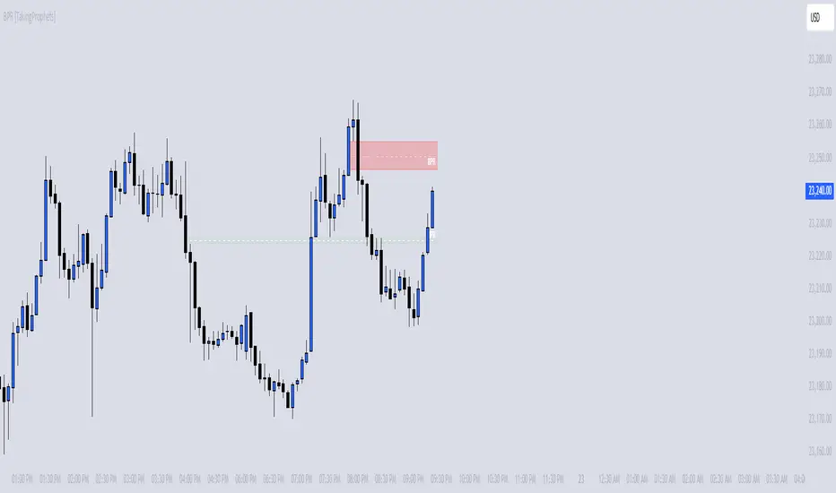
BPR [TakingProphets]The BPR (Balanced Price Range) Indicator by Taking Prophets is built for traders who follow ICT (Inner Circle Trader) concepts and smart money strategies. In ICT methodology, a Balanced Price Range (BPR) occurs when price rapidly moves in one direction, creating an imbalance that often gets revisited before price continues its trend. These areas represent inefficiencies in the market where liquidity was not properly distributed, making them key zones for potential retracements and trade setups.
How the Indicator Works:
🔹 Automatically Detects BPRs – No need to manually mark imbalances; the indicator highlights them for you.
🔹 Helps Identify Smart Money Footprints – Spot areas where price is likely to retrace and rebalance liquidity.
🔹 Customizable Sensitivity – Adjust detection parameters based on your preferred trading style.
🔹 Works Across All Markets – Apply it to Forex, Futures, Crypto, and Stocks on TradingView.
🔹 Clean and Intuitive Interface – Designed to be simple yet powerful for both new and experienced traders.
CandelaCharts - Fib Retracement (OTE) 📝 Overview
The CandelaCharts Fib Retracement (OTE) indicator is a precision tool designed to help traders identify Optimal Trade Entry (OTE) levels based on Fibonacci retracement principles, as taught in ICT (Inner Circle Trader) methodology.
This indicator automatically plots Fibonacci retracement levels between a selected swing high and swing low, highlighting the key OTE zone between the 61.8% and 78.6% retracement levels—a prime area for potential reversals in trending markets.
📦 Features
Automatic & Custom lookback modes
Customizable fib levels
Dynamic coloring
Reverse & extend
⚙️ Settings
Lookback: Controls the number of bars to look back. You can choose between **Automatic** or **Custom** mode.
Line Style: Sets the line style for the Fibonacci levels.
Levels: 0, 0.236, 0.0.382, 0.500, 0.620, 0.705, 0.790, 0.886, 1.000. Allows you to toggle the visibility of Fibonacci levels.
Dynamic Coloring: Colors Fibonacci levels according to trend direction.
Show Labels: Shows the price value at each Fibonacci level.
Reverse: Flips the Fibonacci levels in the opposite direction.
Extend Left: Extends the Fibonacci levels to the left.
⚡️ Showcase
Dynamic Coloring
Manual Coloring
Fib Retracement
Extended
Custom Length
📒 Usage
Using the CandelaCharts Fib Retracement (OTE) is pretty straightforward—just follow these steps to spot high-probability trade setups and refine your entries.
Identify the Trend – Determine whether the market is in an uptrend or downtrend.
Select Swing Points – The indicator automatically plots from the most recent swing high to swing low (or vice versa).
Wait for Price to Enter OTE Zone – Look for price action confirmation within the optimal entry zone (61.8%-78.6%).
Enter the Trade – Consider longs in an uptrend at the OTE zone, and shorts in a downtrend.
Set Stop & Target – Place stops below/above the swing low/high and target extension levels (127.2%, 161.8%).
🎯 Key takeways
The CandelaCharts Fib Retracement (OTE) is a must-have tool for traders looking to refine their entries and maximize risk-reward potential with precision-based ICT trading strategies. 🚀
🚨 Alerts
The indicator does not provide any alerts!
⚠️ Disclaimer
Trading involves significant risk, and many participants may incur losses. The content on this site is not intended as financial advice and should not be interpreted as such. Decisions to buy, sell, hold, or trade securities, commodities, or other financial instruments carry inherent risks and are best made with guidance from qualified financial professionals. Past performance is not indicative of future results.

[TehThomas] - Market Structure Shift (MSS)
- Market Structure Shift (MSS) Script Overview
This TradingView script is designed to help traders identify Market Structure Shifts (MSS) and Breaks of Structure (BOS), which are key concepts in ICT (Inner Circle Trader) and Smart Money Concepts (SMC) trading. By detecting significant shifts in price action, the script provides visual cues and alerts to help traders spot potential trend changes and continuation patterns.
How the Script Works
1. Identifying Swing Highs & Lows
The script detects swing highs and swing lows based on a pivot strength setting (default: 3).
A swing high forms when a candle’s high is higher than the highs of a set number of candles on both sides.
A swing low forms when a candle’s low is lower than the lows of the surrounding candles.
2. Market Structure Shift (MSS) Detection
A bullish MSS occurs when price closes above the most recent swing high after previously being in a bearish trend.
A bearish MSS occurs when price closes below the most recent swing low after being in a bullish trend.
This signals a potential trend reversal and is often a key area for liquidity grabs and smart money entry points.
3. Break of Structure (BOS) Detection (Optional - Can be enabled/disabled in settings)
A BOS is detected when price continues in the direction of the trend, confirming a structural break rather than a shift.
Bullish BOS: Price breaks a swing high but does not reverse (confirms trend continuation).
Bearish BOS: Price breaks a swing low but continues downward.
BOS levels help traders confirm trend strength and potential trade continuation setups.
4. Drawing Structure Lines & Labels
The script plots horizontal lines at the detected MSS and BOS levels.
Labels such as "MSS" or "BOS" appear at the breakout points.
Traders can customize the line style, color, and text size for better visibility.
5. Alert System for MSS & BOS
The script includes alert conditions that notify traders when an MSS or BOS occurs.
Alerts can be set for:
Any MSS / Any BOS
Bullish MSS / Bullish BOS
Bearish MSS / Bearish BOS
Settings You Can Change
The script allows for full customization through the following input parameters:
Pivot Strength (pivot_strength)
Default: 4
Adjusts how many candles must be considered to form a valid swing high or low.
Higher values result in stronger structure points, while lower values detect short-term movements.
Color Settings
Highs Color (highs) → Default: Blue (for bullish structure)
Lows Color (lows) → Default: Red (for bearish structure)
Toggle Display Options
Show BOS (show_bos) → Enables/disables BOS detection.
Show MSS (show_mss) → Enables/disables MSS detection.
Line & Label Customization
BOS Line Style (bos_style) → Options: Solid, Dashed, Dotted
MSS Line Style (mss_style) → Options: Solid, Dashed, Dotted
BOS & MSS Line Width → Adjustable from 1 to 4 pixels
BOS & MSS Text Size → Options: Tiny, Small, Normal, Large, Huge
BOS & MSS Text Position → Options: Left, Center, Right
Why This Script is Useful
✔ Detects Key Market Structure Changes
MSS and BOS are critical for identifying trend reversals and trend continuations.
Helps traders avoid false breakouts by distinguishing between structural shifts and simple breakouts.
✔ Enhances Smart Money Trading Strategies
MSS often aligns with liquidity grabs before price reverses.
BOS confirms continuation trades in strong trends.
Works well with Fair Value Gaps (FVGs), Order Blocks (OBs), and Liquidity Zones.
✔ Customizable Alerts & Visuals
Traders can enable alerts for MSS and BOS to receive notifications when price shifts.
Adjustable styling ensures clarity across different trading setups.
✔ Works on Any Asset & Timeframe
Suitable for Forex, Crypto, Stocks, and Indices.
Can be used on lower timeframes (scalping) or higher timeframes (swing trading).
How to Use the Market Structure Shift Concept in Trading
1️⃣ Identify Market Conditions
Apply the script and check if price is forming Higher Highs (HH), Higher Lows (HL), Lower Highs (LH), or Lower Lows (LL).
Determine if the market is trending or ranging.
2️⃣ Watch for MSS (Reversal Signals)
Bullish MSS: Price closes above a key swing high → potential bullish reversal.
Bearish MSS: Price closes below a swing low → potential bearish reversal.
3️⃣ Confirm BOS (Trend Continuation Signals)
Bullish BOS: Price continues breaking highs, confirming an uptrend.
Bearish BOS: Price continues breaking lows, confirming a downtrend.
4️⃣ Combine with Other ICT & SMC Concepts
Look for Order Blocks (OBs) and Fair Value Gaps (FVGs) near MSS/BOS levels for better trade entries.
Wait for liquidity grabs before entering trades (avoid stop hunts).
Use higher timeframe MSS/BOS zones as key support & resistance areas.
Final Thoughts
This script is a must-have tool for traders using ICT & SMC trading strategies. It helps identify trend shifts, liquidity grabs, and continuation moves by marking Market Structure Shifts (MSS) and Breaks of Structure (BOS) on the chart.

[TehThomas] - ICT Premium & Discount - ICT Premium & Discount: Script Overview
This TradingView script is designed to visualize the ICT (Inner Circle Trader) Premium & Discount Concept by dynamically identifying the key price zones within a specified lookback period. It highlights the Premium Zone, Discount Zone, and Equilibrium Level, helping traders assess where price is trading in relation to historical highs and lows.
How the Script Works
1. Lookback Period Calculation
The script scans the last X bars (user-defined lookback period) to find the highest high and lowest low during that time.
This helps establish a reference range for determining whether the current price is trading in a premium (overbought) or discount (oversold) area.
2. Equilibrium Level
The equilibrium is simply the midpoint between the highest high and the lowest low within the lookback period.
This level serves as a fair value price where price often reacts or consolidates.
3. Drawing the Premium & Discount Zones
The script creates two distinct zones:
Premium Zone (above equilibrium): Price is considered expensive.
Discount Zone (below equilibrium): Price is considered cheap.
These zones are displayed using colored boxes (red for premium, green for discount).
4. Equilibrium Line & Labels
A dashed equilibrium line is plotted at the midpoint to give a visual reference.
Labels for Premium, Discount, and Equilibrium are added to help traders quickly identify these levels.
Settings You Can Change
The script includes multiple input parameters that allow customization:
1. Lookback Period (lookback)
Default: 50 bars
Defines how many past candles to analyze for the highest high and lowest low.
A larger lookback provides a broader market structure, while a smaller one captures short-term moves.
Premium Zone Color (premium_color)
Default: Red (80% transparency)
You can modify this to change how the premium zone appears on the chart.
Discount Zone Color (discount_color)
Default: Green (80% transparency)
Allows customization of the discount zone’s color.
Extend Boxes Right (extend_right)
Default: 15 bars
Defines how far the premium and discount boxes extend into the future for better visibility.
Why This Script is Useful
Identifies High-Probability Trade Zones.
Traders can use the Premium & Discount zones to find optimal trade entries based on ICT concepts.
Buy in the Discount Zone and sell in the Premium Zone when confluence aligns.
Enhances Smart Money Concepts (SMC) Trading
ICT traders look for liquidity sweeps, fair value gaps, and order blocks.
Combining these with premium & discount levels increases trade accuracy.
Works on Any Timeframe & Asset
The script is effective across forex, crypto, stocks, and indices on multiple timeframes.
How to Use the ICT Premium & Discount Concept in Trading
Find the Range
Apply the script to your chart and check the premium and discount levels.
Ensure you are using a relevant lookback period (e.g., 50 bars for intraday, 100+ for higher timeframes).
Wait for Price to Enter a Key Zone
Long Trades: Look for bullish confirmations (e.g., liquidity grabs, order blocks) in the Discount Zone.
Short Trades: Seek bearish setups in the Premium Zone where price is expensive.
Use the Equilibrium as a Reaction Zone
Price often bounces off or retests equilibrium before making a directional move.
Consider it as a dynamic support/resistance level.
Combine with Other ICT Concepts
Fair Value Gaps (FVGs): Look for price inefficiencies inside premium/discount zones.
Liquidity Sweeps: Watch for stop hunts and false breakouts before entering trades.
Order Blocks (OBs): Use smart money footprints to refine your entries.
Final Thoughts
This script is a powerful tool for ICT traders looking to refine their premium & discount analysis. By visually separating the market into premium (overbought) and discount (oversold) zones, traders can make more informed, high-probability trading decisions.